Miniatures Collection
Management
A New
Outfit for a Priceless
Collection
tansey-miniatures.com
2019/2021
Website & Year
- tansey-miniatures.com
- 2019/2021
Client
- The Tansey Miniatures Foundation
- Photo Credit
- Schmedding Fotodesign
- The Tansey Miniatures Foundation
Scope
- Concept
- Branding
- UI / UX Design
- App Development
- Custom DAM System
Index
- 01. The Foundation
- 02. About the Project
- 03. The Design
- 04. Layout and Grid
- 05. Colors
- 06. Typography
- 07. Iconography
- 08. Choreography
- 09. tansey-miniatures.com
The Tansey Miniatures Foundation

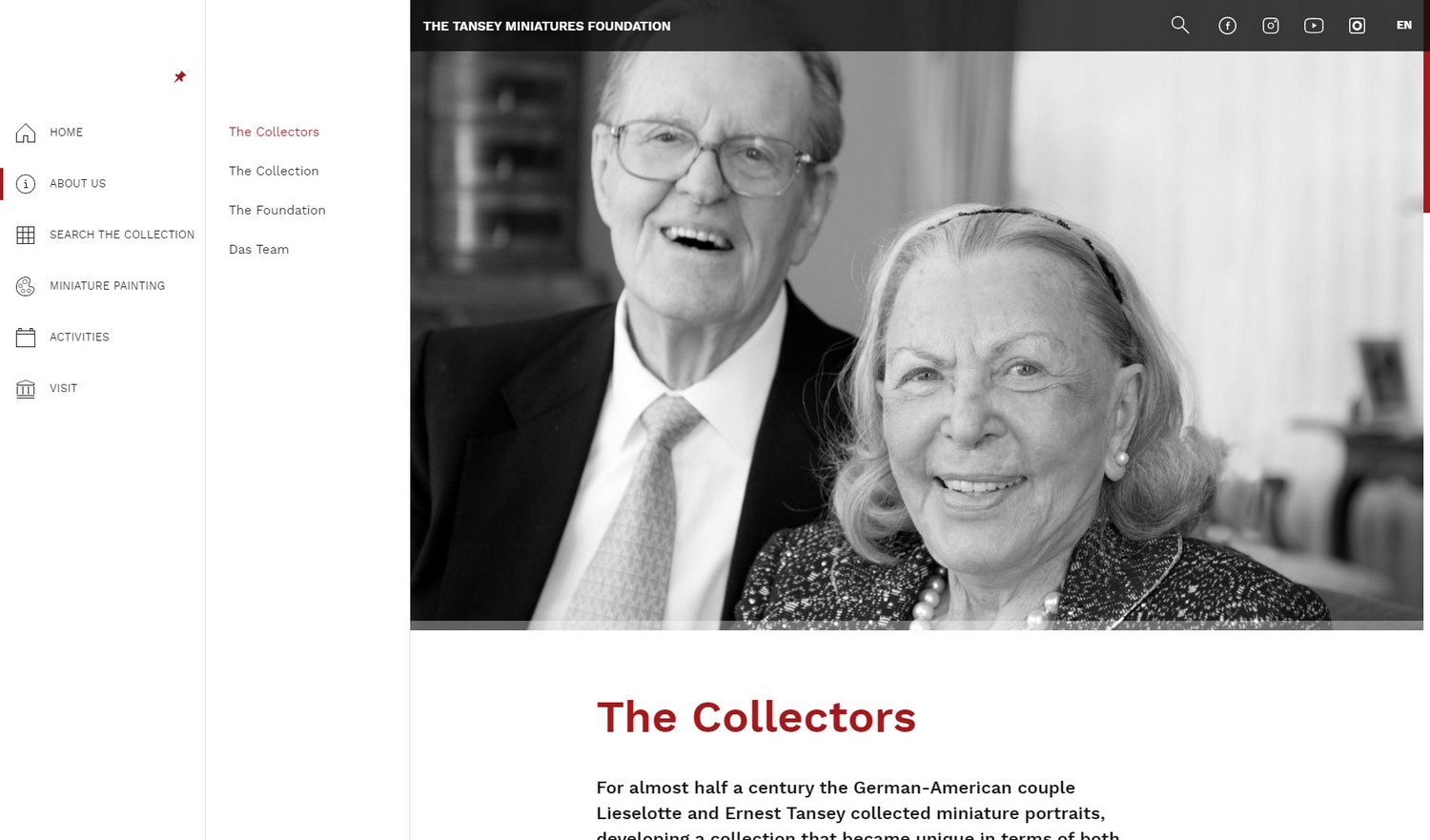
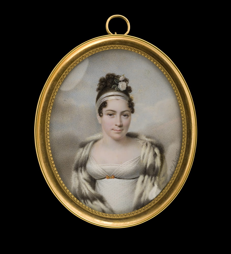
The German-American couple Lieselotte and Ernest Tansey collected portrait miniatures for almost half a century. Over time, they created a unique and rare collection of miniatures from the end of the 16th to the beginning of the 20th century.
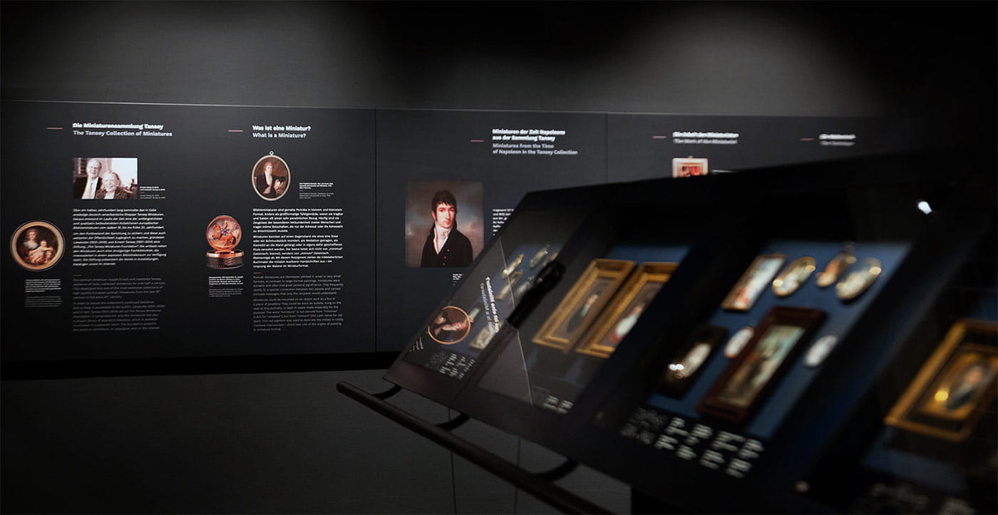
The collection can be viewed at the Bomann-Museum in Celle (Lower Saxony, Germany) — the hometown of Mrs. Lieselotte Tansey, where she lived with her husband. The Tansey Miniatures Collection is one of the world’s largest and most important collections of its kind.
The Project
Since 2013 we have been helping the Tansey Miniatures Foundation to stay ahead of the curve of art presentation and management. In 2020, we released a new version of the website.
The custom Digital Asset Management System we created for the foundation is the core of all information related to the management of the entire collection. Through fine-grained access control, it helps an international team of art historians, photographers, editors and even translators gather knowledge and high-fidelity documentation and preserve this unique collection for generations to come.
The intelligent DAM system architecture allows for real-time search and filtering and lets visitors find the information they need instantaneously — without any delay.
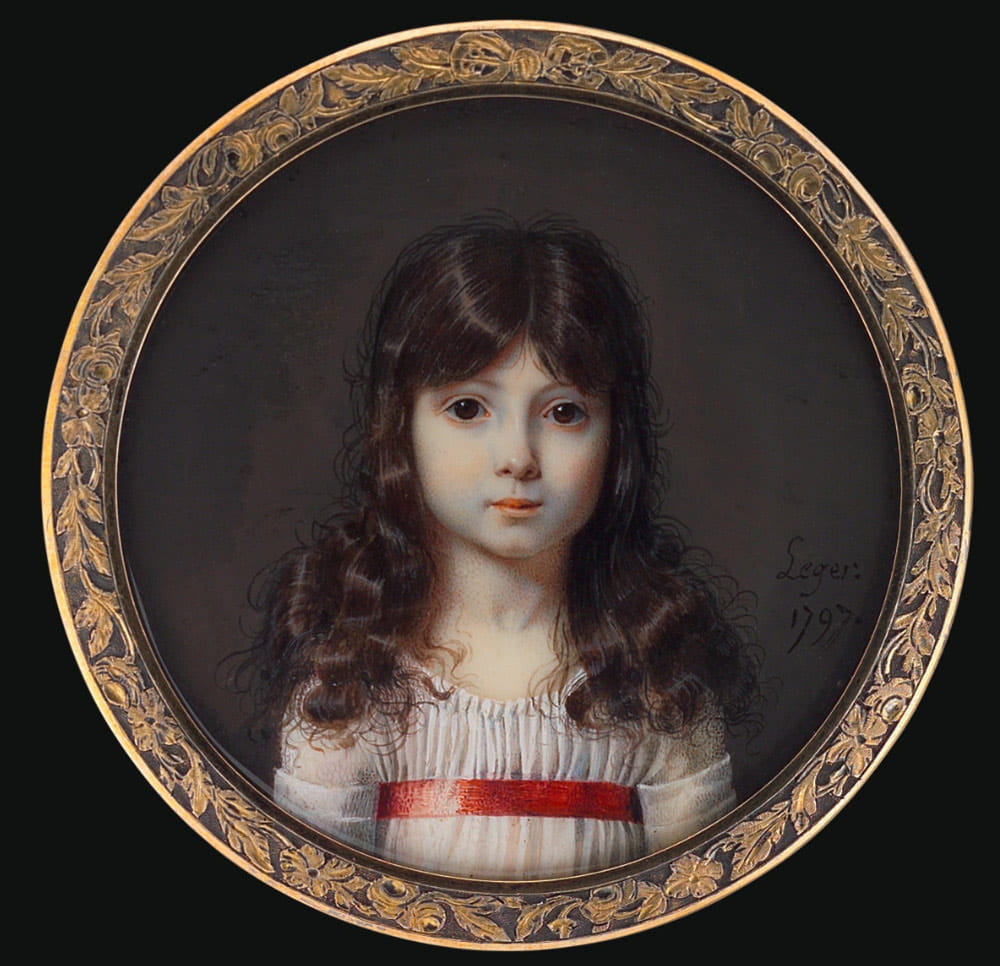
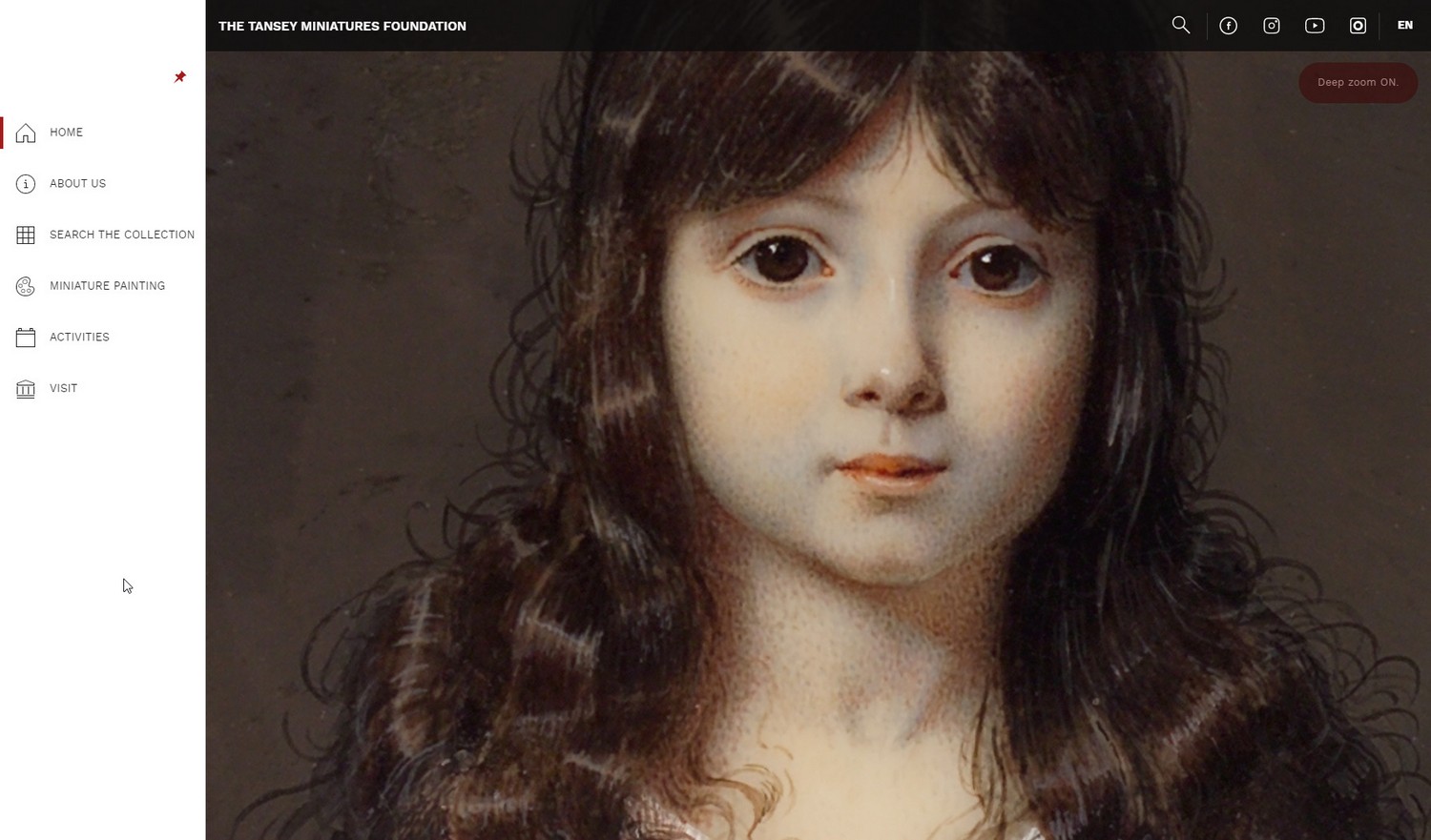
For visitors of the website and also the POI stand in the museum, it provides a highly engaging experience that allows to take a deep dive into the fascinating world of miniatures. The Deep Zoom technology takes this point quite literally, allowing to view these tiny — mostly around 5 × 5 cm (~ 2 × 2 in) large — miniatures zoomed-in to the finest brush strokes. The high-resolution archival photographs — the work of Schmedding Fotodesign in Hamburg, Germany — deliver a tremendous resource of information for art professionals and an astonishing view for all art lovers. Every miniature has undergone professional analysis and cataloging by a team of highly experienced art historians in the field.
The clear and fresh design and UI/UX approach breaks away from the norm and shapes a novel, engaging and immersive digital experience, setting a new standard to art presentation.
The Design
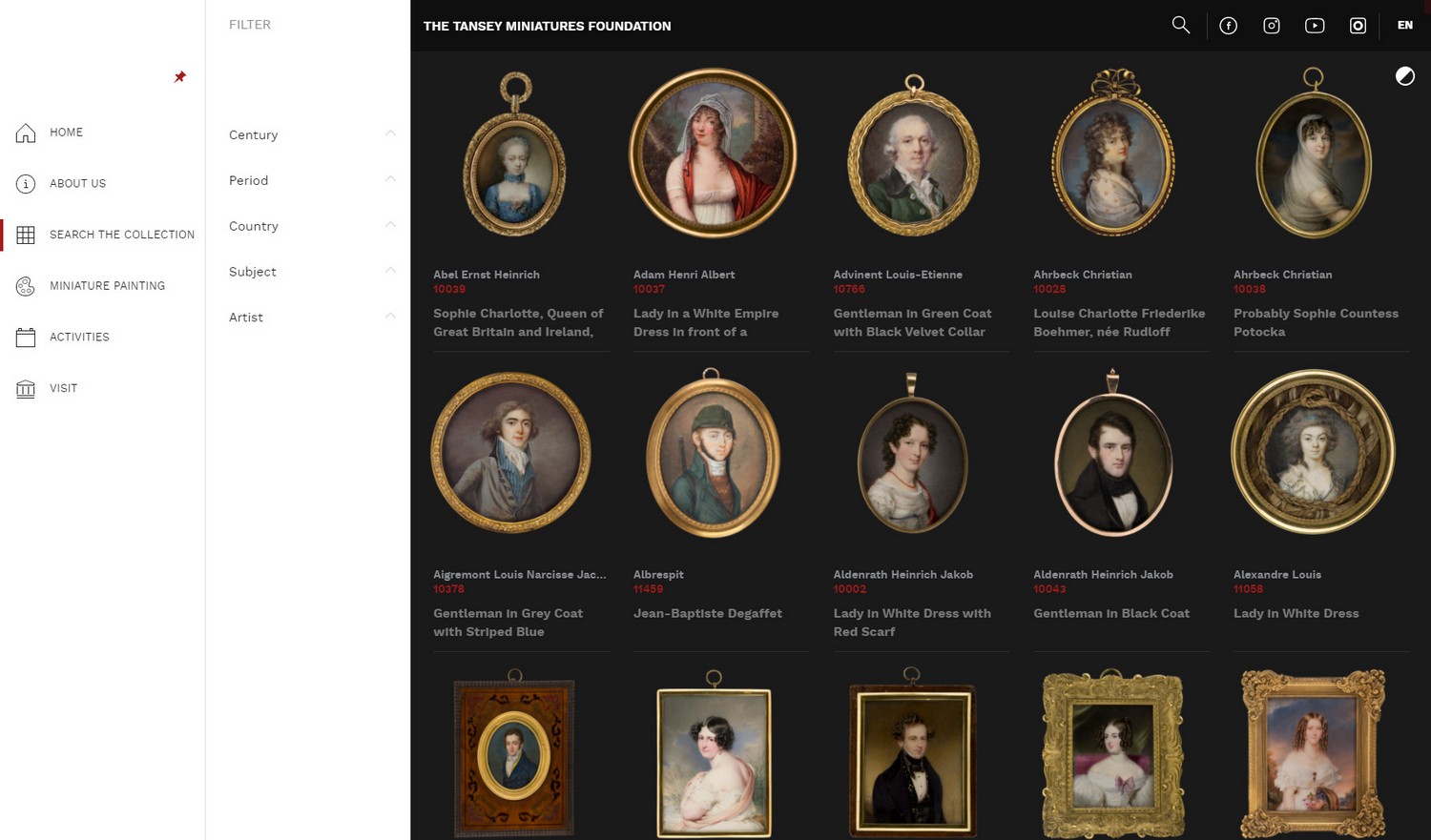
with Filtering Tools
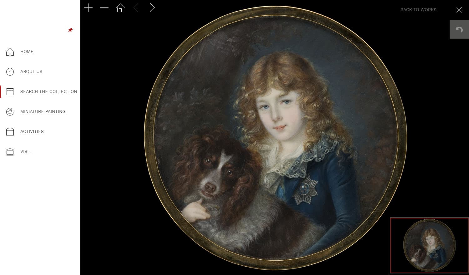
Deep Zoom Functionality
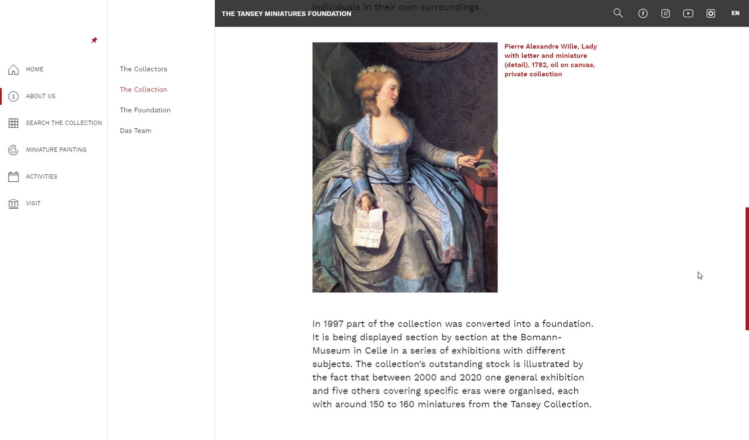
The Collection
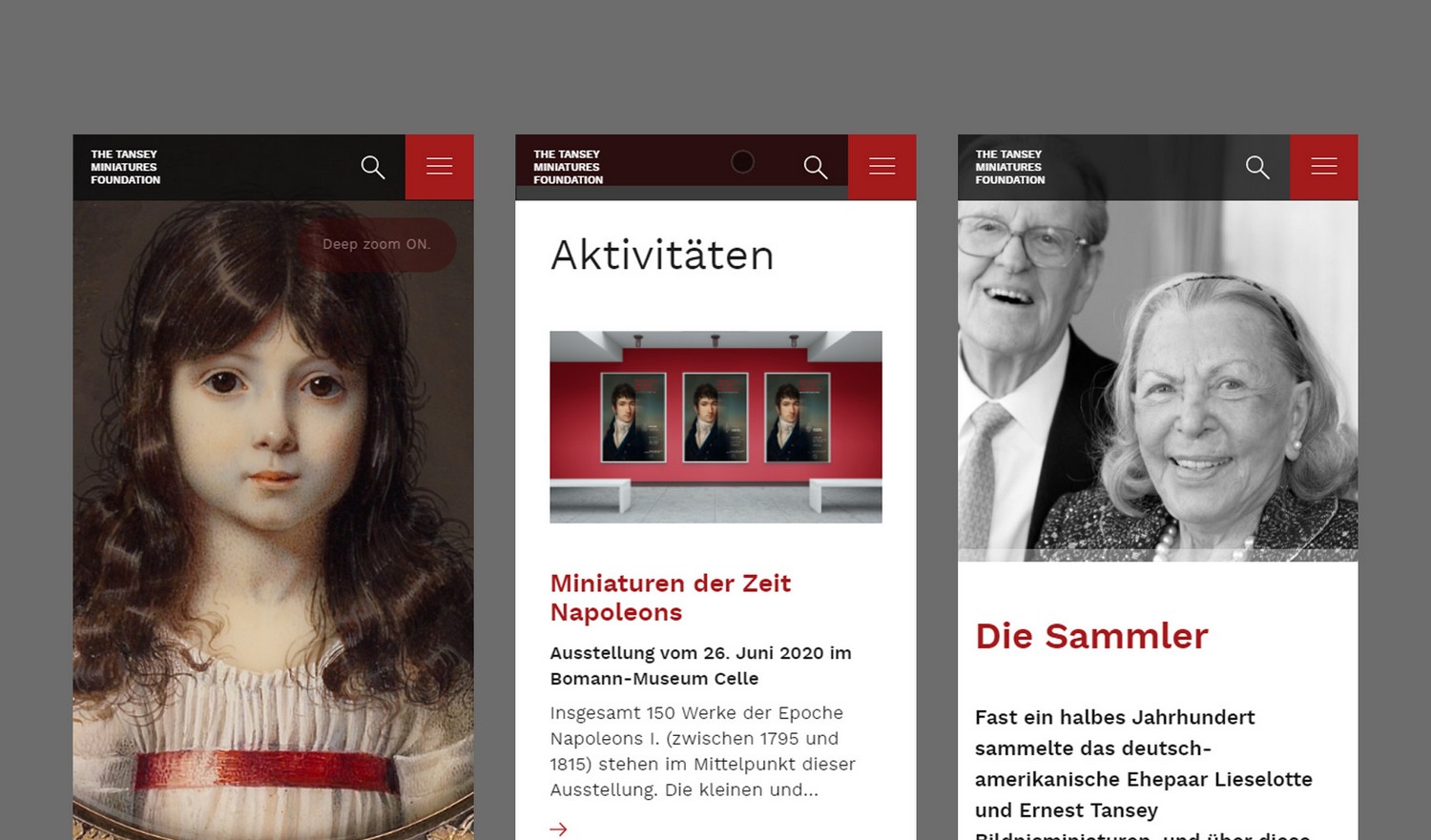
Layout
The interface of the system for viewing and searching miniatures was inspired by our own DAM solutions developed in-house in recent years, which we tailored to the individual needs of the foundation. The UI follows the philosophy derived from our Active Surface Design System and is highly optimized for the task of art presentation.
Navigating the project becomes very intuitive and convenient by assuring that content is easily accessible within a few clicks or taps.
We use a clear visual hierarchy by dividing the layout into three intuitive logical areas: (A) NAVIGATION (defining the initial task), (B) FILTERS (narrowing down the results) and (C) VISUALIZATION + Edition (the outcome).
Colors
Royal colors to support unique objects
The characters depicted in miniatures evoke emotions like mystery, elegance, sophistication and power. Seriousness, history, rich cultural heritage and royalty shines from their eyes. Black and dark shades of scarlet reflect these feelings.
The primary hues are contrasted against white and shades of light gray, which express purity, freshness, and clarity.
Typography
Work Sans speaks in a very pleasant voice. It expresses positivity, friendliness, confidence and professionalism.
The roundness of the letters harmonizes with the usually oval-shaped miniatures. Loosely referencing early Grotesques, Work Sans brings a breath of modernity and allows the content to speak.
The regular up to the bold weights are optimized for on-screen usage, what makes them a great fit for interface design, while keeping a charismatic and individual persona. This allowed us to bridge the requirements of high legibility and warmth, which invites readers to dive deeper into the history of miniatures.
Work Sans, designed by Wei Huang, is a font family that consists of 10 thicknesses ranging from thin to ultra-thick. Since 2020 the font is also available as a variable font family.

Iconography
For the Tansey Miniature project, we decided to use 1 pixel, delicate icons from our in-house developed Futuramo Icon System. The square-light style from the Icon Style Matrix harmonizes well with the chosen typeface weights and the general design language. This results in an elegant, understated presence, allowing the sophisticated museum-like content to remain the main focal point of the experience.
In the side navigation, icons serve as visual support for text labels. When collapsing the navigation, icons appear on their own. This helps with navigation on mobile devices offering less screen real estate. Widely recognized symbols in the upper bar represent the site search and social media used by the foundation.
Choreography
The project uses subtle animations and transitions following our Narrative Design philosophy. Their role is to strengthen the immersive experience and encourage visitors to follow the story and explore the rich and informative content of the project.
Since there is no waiting time between navigation changes, we use this technological characteristic to emphasize a feeling of transcendence by fluently merging transitions.
For example, in the descriptive sections (About us, Miniature Painting) the cover photo zooms out, focusing the viewer inwards, revealing the title and the teaser. The photos usually show a detail or a close-up of the face and the eyes. Readers follow these visual cues and are invited to truly delve into the story.
See the
Beautiful
Ones

